An example classification problem#
Show code cell content
import warnings
warnings.filterwarnings("ignore")
Show code cell content
import os
from nilearn import datasets
os.environ["NILEARN_SHARED_DATA"] = "~/shared/data/nilearn_data"
datasets.get_data_dirs()
['~/shared/data/nilearn_data', '/Users/emdupre/nilearn_data']
Now that we’ve seen how to create a connectome for an individual subject,
we’re ready to think about how we can use this connectome in a machine learning analysis.
We’ll keep working with the same development_dataset,
but now we’d like to see if we can predict age group
(i.e. whether a participant is a child or adult) based on their connectome,
as defined by the functional connectivity matrix.
We’ll also explore whether we’re more or less accurate in our predictions based on how we define functional connectivity. In this example, we’ll consider three different different ways to define functional connectivity between our Multi-Subject Dictional Learning (MSDL) regions of interest (ROIs): correlation, partial correlation, and tangent space embedding.
To learn more about tangent space embedding and how it compares to standard correlations, we recommend [1].
Load brain development fMRI dataset and MSDL atlas#
First, we need to set up our minimal environment.
This will include all the dependencies from the last notebook,
loading the relevant data using our nilearn data set fetchers,
and instantiated our NiftiMapsMasker and ConnectivityMeasure objects.
import numpy as np
import matplotlib.pyplot as plt
from nilearn import (datasets, maskers, plotting)
from nilearn.connectome import ConnectivityMeasure
development_dataset = datasets.fetch_development_fmri(n_subjects=30)
msdl_atlas = datasets.fetch_atlas_msdl()
masker = maskers.NiftiMapsMasker(
msdl_atlas.maps, resampling_target="data",
t_r=2, detrend=True,
low_pass=0.1, high_pass=0.01).fit()
correlation_measure = ConnectivityMeasure(kind='correlation')
Show code cell output
[fetch_development_fmri] Dataset found in /Users/emdupre/nilearn_data/development_fmri
[fetch_development_fmri] Dataset found in /Users/emdupre/nilearn_data/development_fmri/development_fmri
[fetch_development_fmri] Dataset found in /Users/emdupre/nilearn_data/development_fmri/development_fmri
[fetch_atlas_msdl] Dataset found in /Users/emdupre/nilearn_data/msdl_atlas
Now we should have a much better idea what each line above is doing! Let’s see how we can use these objects across many subjects, not just the first one.
Building our dataset#
First, we can loop through the 30 participants and extract a few relevant pieces of information, including their functional scan, their confounds file, and whether they were a child or adult at the time of their scan.
Using this information, we can then transform their data using the NiftiMapsMasker we created above.
As we learned last time, it’s really important to correct for known sources of noise!
So we’ll also pass the relevant confounds file directly to the masker object to clean up each subject’s data.
children = []
pooled_subjects = []
groups = [] # child or adult
for func_file, confound_file, (_, phenotypic) in zip(
development_dataset.func,
development_dataset.confounds,
development_dataset.phenotypic.iterrows()
):
time_series = masker.transform(func_file, confounds=confound_file)
pooled_subjects.append(time_series)
if phenotypic['Child_Adult'] == 'child':
children.append(time_series)
groups.append(phenotypic['Child_Adult'])
print(f'Data has {len(children)} children.')
Data has 24 children.
We can see that this data set has 24 children. This is roughly proportional to the original participant pool, which had 122 children and 33 adults.
We’ve also created a list in pooled_subjects containing all of the cleaned data.
Remember that each entry of that list should have a shape of (168, 39).
We can quickly confirm that this is true:
print(pooled_subjects[0].shape)
(168, 39)
ROI-to-ROI correlations in children#
First, we’ll use the most common kind of connectivity–and the one we used in the last section–correlation. It models the full (marginal) connectivity between pairwise ROIs.
correlation_measure expects a list of time series,
so we can directly supply the list of ROI time series we just created.
It will then compute individual correlation matrices for each subject.
First, let’s just look at the correlation matrices for our 24 children,
since we expect these matrices to be similar:
correlation_matrices = correlation_measure.fit_transform(children)
Now, all individual coefficients are stacked in a unique 2D matrix.
print('Correlations of children are stacked in an array of shape {0}'
.format(correlation_matrices.shape))
Correlations of children are stacked in an array of shape (24, 39, 39)
We can also directly access the average correlation across all fitted subjects using the mean_ attribute.
mean_correlation_matrix = correlation_measure.mean_
print('Mean correlation has shape {0}.'.format(mean_correlation_matrix.shape))
Mean correlation has shape (39, 39).
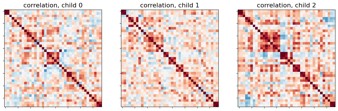
Let’s display the functional connectivity matrices of the first 3 children:
_, axes = plt.subplots(1, 3, figsize=(15, 5))
for i, (matrix, ax) in enumerate(zip(correlation_matrices, axes)):
plotting.plot_matrix(matrix, colorbar=False, axes=ax,
vmin=-0.8, vmax=0.8,
title='correlation, child {}'.format(i))
Just as before, we can also display connectome on the brain. Here, let’s show the mean connectome over all 24 children.
plotting.view_connectome(mean_correlation_matrix, msdl_atlas.region_coords,
edge_threshold=0.2,
title='mean connectome over all children')
Studying partial correlations#
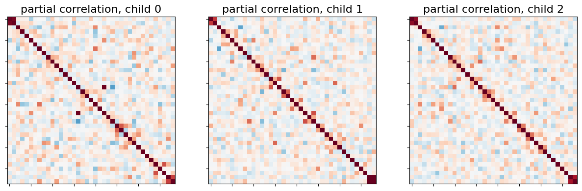
Rather than looking at the correlation-defined functional connectivity matrix, we can also study direct connections as revealed by partial correlation coefficients.
To do this, we can use exactly the same procedure as above, just changing the ConnectivityMeasure kind:
partial_correlation_measure = ConnectivityMeasure(kind='partial correlation')
partial_correlation_matrices = partial_correlation_measure.fit_transform(
children)
Right away, we can see that most of direct connections are weaker than full connections for the first three children:
_, axes = plt.subplots(1, 3, figsize=(15, 5))
for i, (matrix, ax) in enumerate(zip(partial_correlation_matrices, axes)):
plotting.plot_matrix(matrix, colorbar=False, axes=ax,
vmin=-0.8, vmax=0.8,
title='partial correlation, child {}'.format(i))
This is also visible when we display the mean partial correlation connectome:
plotting.view_connectome(
partial_correlation_measure.mean_, msdl_atlas.region_coords,
edge_threshold=0.2,
title='mean partial correlation over all children')
Using tangent space embedding#
An alternative method to both correlations and partial correlation is tangent space embedding. Tangent space embedding uses both correlations and partial correlations to capture reproducible connectivity patterns at the group-level.
Using this method is as easy as changing the kind of ConnectivityMeasure
tangent_measure = ConnectivityMeasure(kind='tangent')
We fit our children group and get the group connectivity matrix stored as
in tangent_measure.mean_, and individual deviation matrices of each subject
from it.
tangent_matrices = tangent_measure.fit_transform(children)
tangent_matrices model individual connectivities as
perturbations of the group connectivity matrix tangent_measure.mean_.
Keep in mind that these subjects-to-group variability matrices do not
directly reflect individual brain connections. For instance negative
coefficients can not be interpreted as anticorrelated regions.
_, axes = plt.subplots(1, 3, figsize=(15, 5))
for i, (matrix, ax) in enumerate(zip(tangent_matrices, axes)):
plotting.plot_matrix(matrix, colorbar=False, axes=ax,
vmin=-0.8, vmax=0.8,
title='tangent offset, child {}'.format(i))
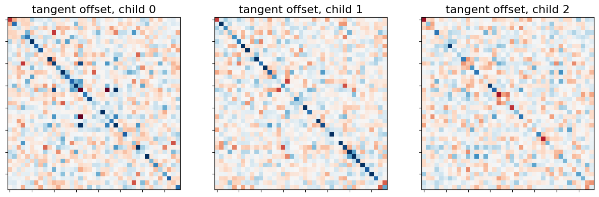
We don’t show the mean connectome here as average tangent matrix cannot be interpreted, since individual matrices represent deviations from the mean, which is set to 0.
Using connectivity in a classification analysis#
We can use these connectivity matrices as features in a classification analysis to distinguish children from adults. This classification analysis can be implmented directly in scikit-learn, including all of the important considerations like cross-validation and measuring classification accuracy.
First, we’ll randomly split participants into training and testing sets 15 times.
StratifiedShuffleSplit allows us to preserve the proportion of children-to-adults in the test set.
We’ll also compute classification accuracies for each of the kinds of functional connectivity we’ve identified:
correlation, partial correlation, and tangent space embedding.
from sklearn.metrics import accuracy_score
from sklearn.model_selection import StratifiedShuffleSplit
from sklearn.svm import LinearSVC
kinds = ['correlation', 'partial correlation', 'tangent']
_, classes = np.unique(groups, return_inverse=True)
cv = StratifiedShuffleSplit(n_splits=15, random_state=0, test_size=5)
pooled_subjects = np.asarray(pooled_subjects)
Now, we can train the scikit-learn LinearSVC estimator to on our training set of participants
and apply the trained classifier on our testing set,
storing accuracy scores after each cross-validation fold:
scores = {}
for kind in kinds:
scores[kind] = []
for train, test in cv.split(pooled_subjects, classes):
# *ConnectivityMeasure* can output the estimated subjects coefficients
# as a 1D arrays through the parameter *vectorize*.
connectivity = ConnectivityMeasure(kind=kind, vectorize=True)
# build vectorized connectomes for subjects in the train set
connectomes = connectivity.fit_transform(pooled_subjects[train])
# fit the classifier
classifier = LinearSVC().fit(connectomes, classes[train])
# make predictions for the left-out test subjects
predictions = classifier.predict(
connectivity.transform(pooled_subjects[test]))
# store the accuracy for this cross-validation fold
scores[kind].append(accuracy_score(classes[test], predictions))
After we’ve done this for all of the folds, we can display the results!
mean_scores = [np.mean(scores[kind]) for kind in kinds]
scores_std = [np.std(scores[kind]) for kind in kinds]
plt.figure(figsize=(6, 4))
positions = np.arange(len(kinds)) * .1 + .1
plt.barh(positions, mean_scores, align='center', height=.05, xerr=scores_std)
yticks = [k.replace(' ', '\n') for k in kinds]
plt.yticks(positions, yticks)
plt.gca().grid(True)
plt.gca().set_axisbelow(True)
plt.gca().axvline(.8, color='red', linestyle='--')
plt.xlabel('Classification accuracy\n(red line = chance level)')
plt.tight_layout()
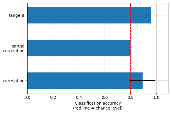
This is a small example to showcase nilearn features. In practice such comparisons need to be performed on much larger cohorts and several datasets. [1] showed that across many cohorts and clinical questions, the tangent kind should be preferred.
Combining nilearn and scikit-learn can allow us to perform many (many) kinds of machine learning analyses, not just classification! We encourage you to explore the Examples and User Guides on the Nilearn website to learn more.